
Designing a Liquipedia app Promotion Page
To introduce web users to the Liquipedia app and its key features, I designed a dedicated app download page focused on clarity, engagement, and conversion.
Role
UX Design Intern — research, information architecture, wireframing, visual design, and iteration.
The Problem
Although Liquipedia had a large and active web audience, many users were unaware of the mobile app or its benefits. The existing website did little to introduce the app or guide users toward downloading it.
The challenge was to design a landing page that clearly communicated the app’s value and encouraged downloads—without overwhelming users.
Approach
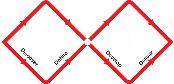
I followed a compact Double Diamond process, focusing on research, exploration, and iteration.
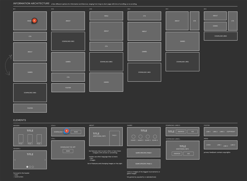
Through early research, I identified key motivations and barriers for app adoption. I then explored multiple information architecture options, ranging from compact, non-scrolling layouts to longer, scrollable pages.
Researched user needs and best practices for app promotion pages.
Testing these approaches revealed that a longer, progressive layout kept users engaged longer and allowed features to be introduced gradually, rather than presenting everything at once.
After studying the purpose and target audience, I explored different information architectures, ranging from a compact, non-scrolling page to an extended, scrollable version. The longer version was chosen as it kept users engaged while exploring the app’s benefits, rather than displaying everything at once, which could lead to quick exits.
Design & Iteration
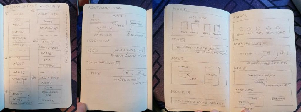
Low-fidelity wireframes helped define a clear structure with:
- a strong visual hero
- a persistent top navigation
- a clear, always-visible Call to Action
Created multiple low and high-fidelity wireframes, experimenting with layouts, styles, and colors.
The page was later adapted for mobile to ensure accessibility across devices.
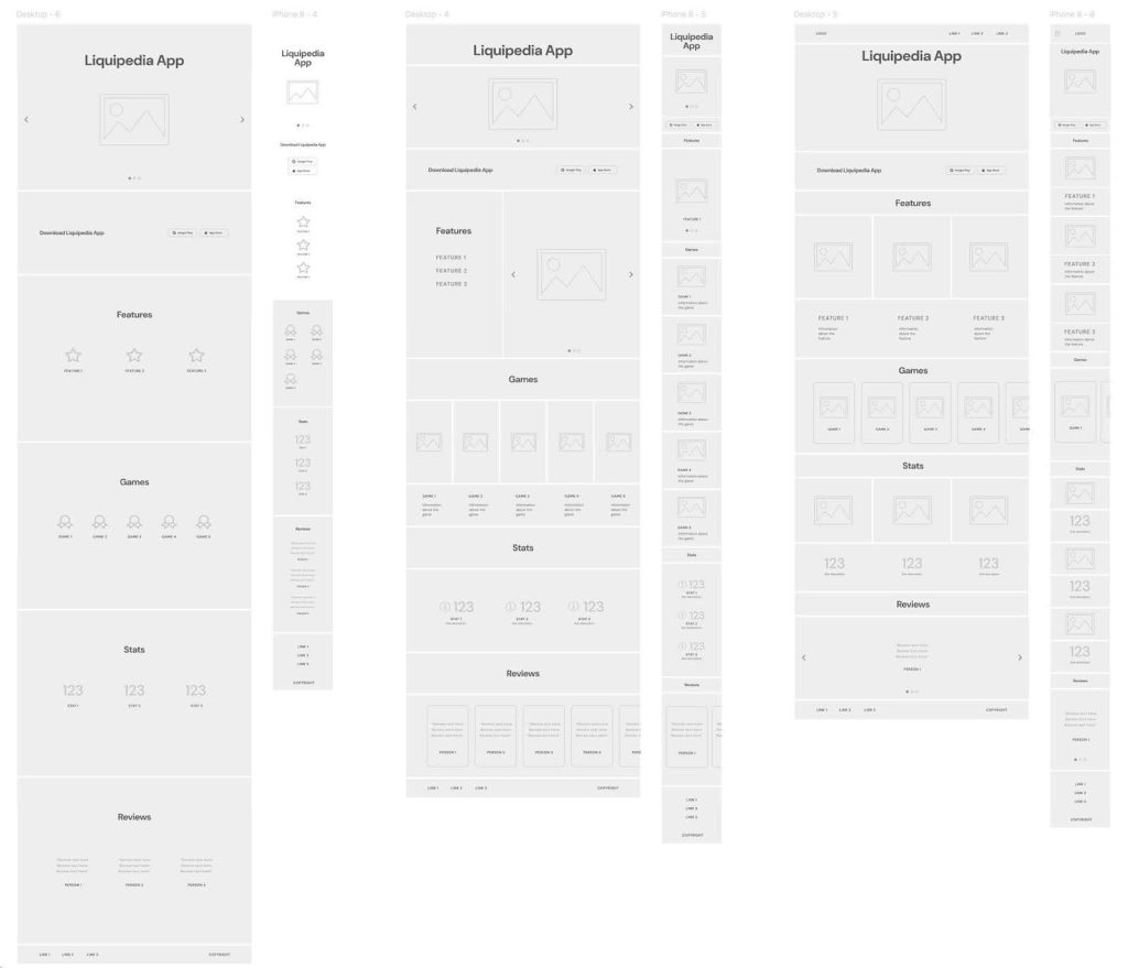
Through low-fidelity wireframes I discovered that the final layout should feature a top navigation bar and a clear Call to Action (CTA) button for easy access.
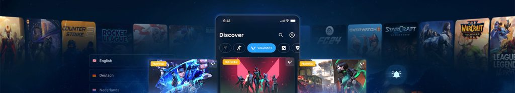
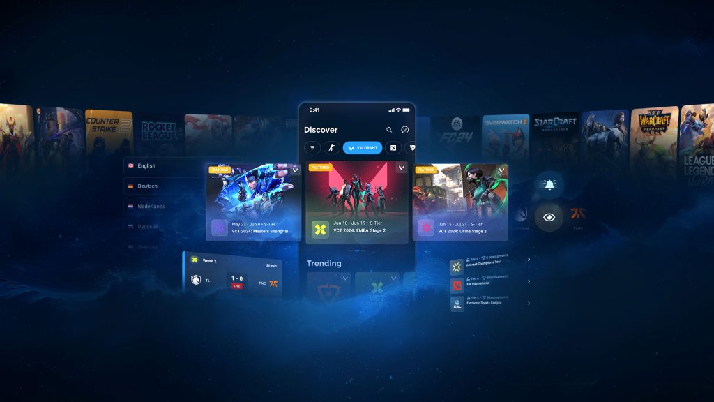
In the high-fidelity phase, I explored multiple visual directions. The final design was selected because it best reflected the app’s look and feel, creating a seamless transition from website to app while maintaining brand consistency.
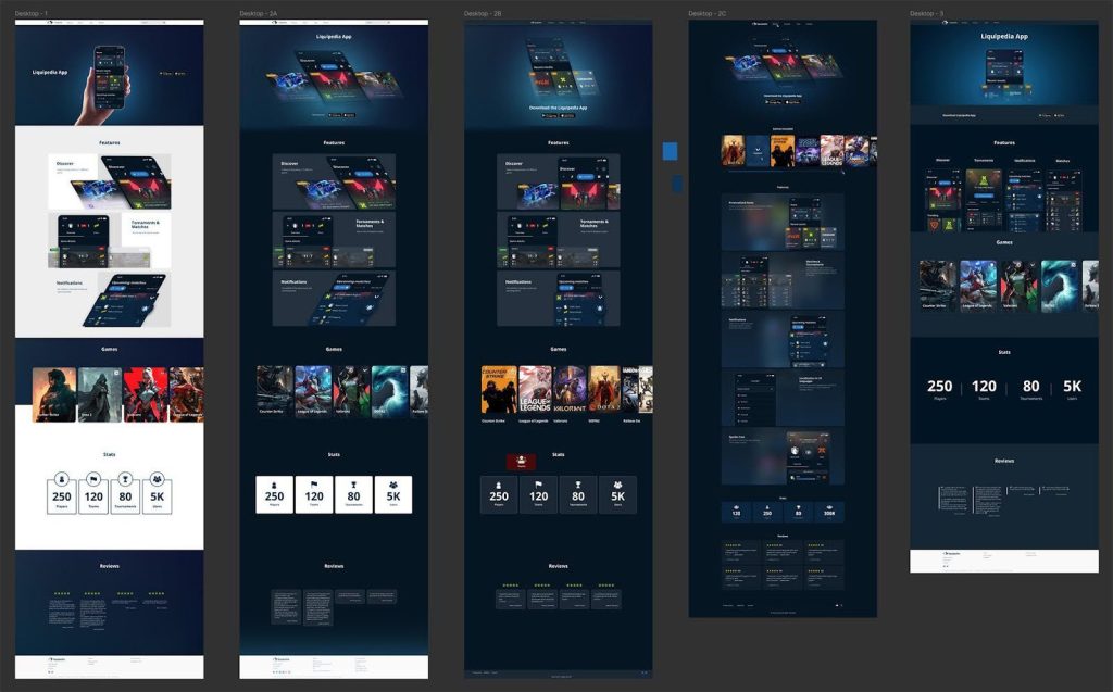
Various high-fidelity wireframes were created, experimenting with different styles, colors, and effects. The third option was selected as it best reflected the app’s experience and provided a seamless transition from the website to the app.
Outcome & Impact
- Created a clear onboarding moment from web to app
- Reinforced visual and experiential consistency between platforms
- Insights from this project directly influenced the decision to redesign the Liquipedia homepage, which became the core focus of my internship
Key Takeaways
- First impressions matter: App adoption starts with clear onboarding
- Long pages can work: When information is revealed progressively
- Consistency builds trust: Visual continuity helps users move between platforms
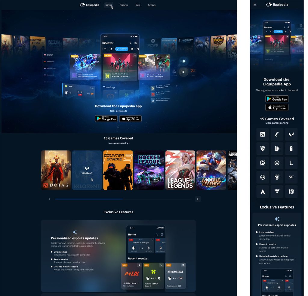
This version was further refined, including a mobile-friendly adaptation. The project highlighted the importance of onboarding and first impressions, reinforcing the need for an engaging Home Page—ultimately leading to the decision to focus on its redesign as the core of my internship.
Check out the landing page