
Expanding the Core Functionality of Liquipedia App

To improve long-term engagement, Liquipedia aimed to introduce Series Pages—allowing users to follow entire esports tournament series instead of tracking individual events one by one.
Role
UX Design Intern — ideation, wireframing, prototyping, and usability testing.
The Problem
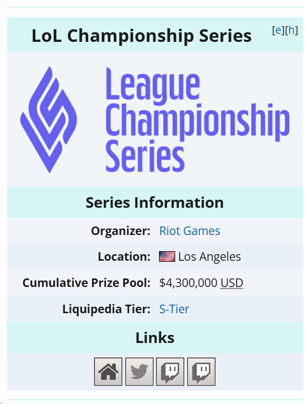
Users wanted to follow entire tournament series (such as LCS, RLCS, or The International) and receive updates across multiple events without manually following each tournament.
From a product perspective, this limited repeat engagement and made it harder for users to stay connected to ongoing competitive scenes.
User need
“As a user, I want to receive updates for entire tournament series so I don’t miss important matches or events, even when I don’t closely follow every tournament.”
Approach
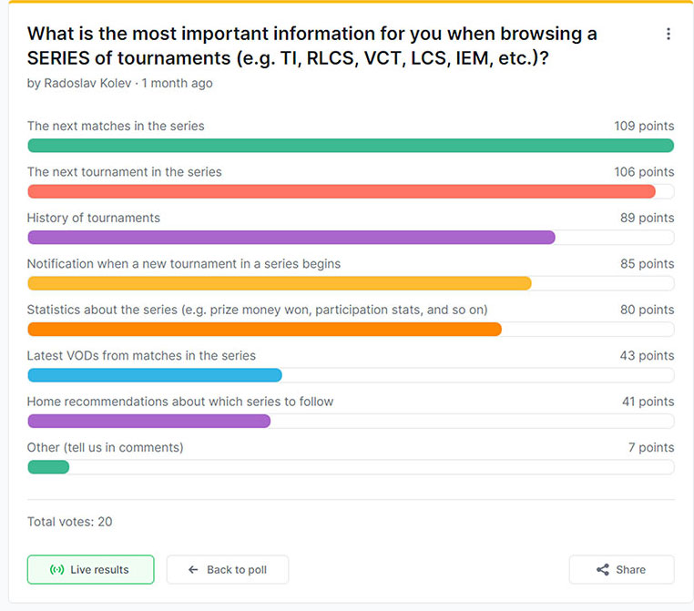
Research showed that users valued:
- customizable notifications
- easy discovery of relevant series
- clear differentiation between series and individual tournaments
Since Liquipedia.net already offered rich Series Pages, the challenge was translating this depth into the app without overwhelming users.
The research highlighted the need for a clear and structured way to present series information without overwhelming users. By analyzing user expectations and competitive benchmarks, we identified key elements to prioritize, ensuring the design remained concise, accessible, and seamlessly integrated within the app’s existing UI
Design & Iteration
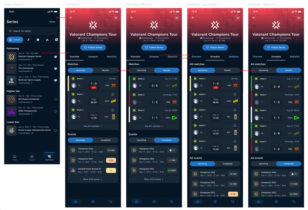
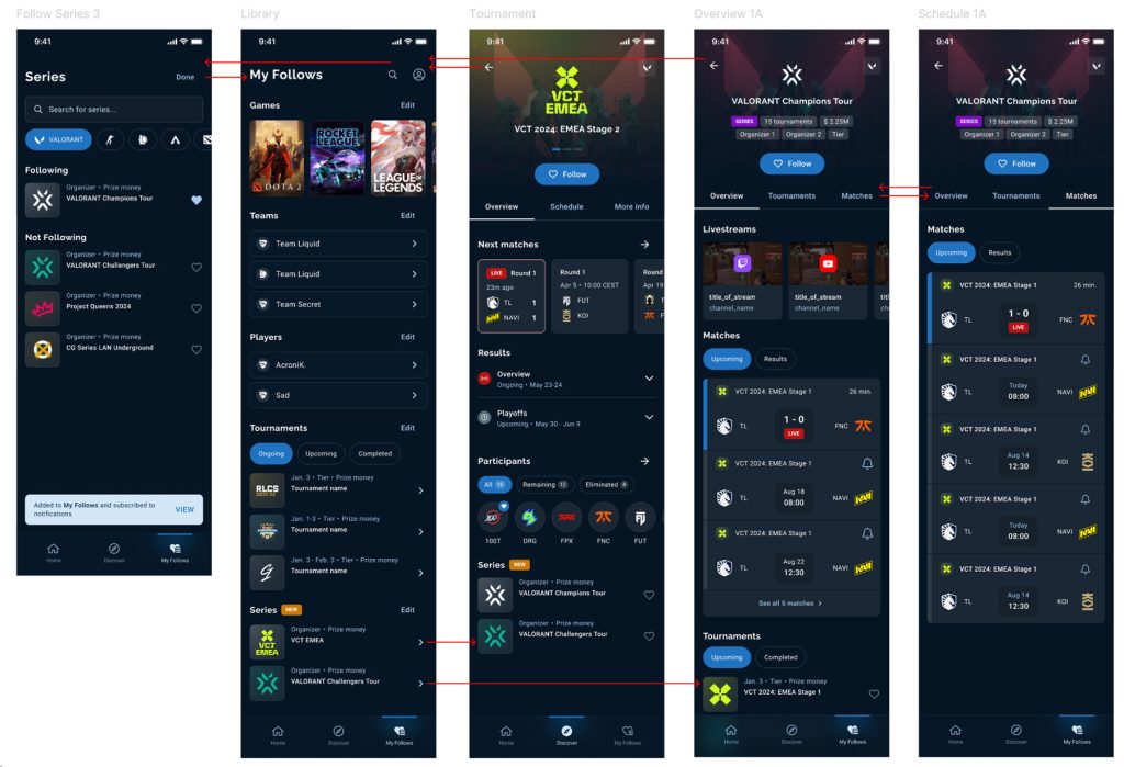
I explored multiple ways of integrating Series into the existing app structure, focusing on My Follows as the natural entry point.
Through sketches, wireframes, and interactive prototypes, I tested:
- how users discover and follow series
- how series relate to tournaments and matches
- how much information should be shown upfront
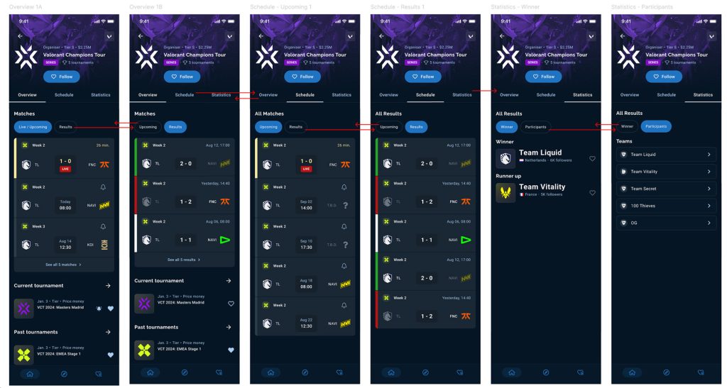
Progressive disclosure became a key design principle—showing essential information first, with tabs and expandable sections for deeper exploration.
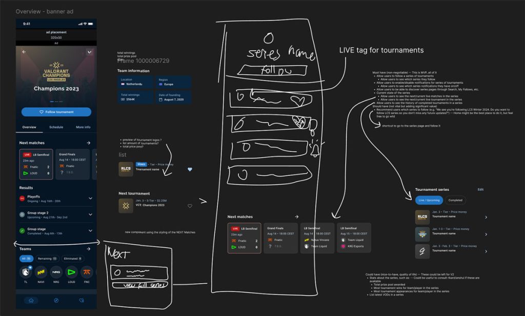
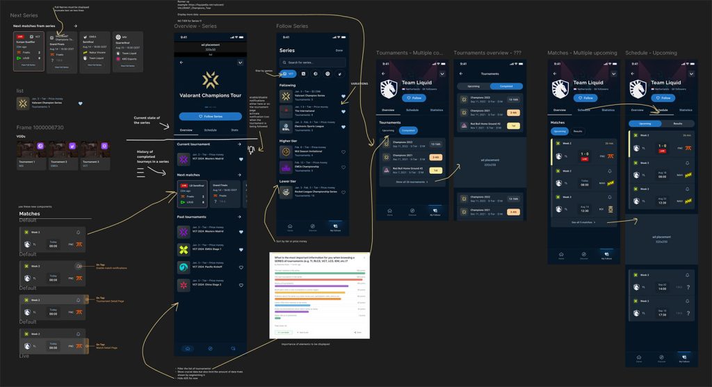
I Built interactive prototypes for quick usability tests.
Key Challenges & Solutions
Differentiating series vs. tournaments
→ Introduced clear visual hierarchy and distinct follow states.
Avoiding UI clutter
→ Used tabs, filters (Upcoming / Results), and expandable sections to keep the interface focused and readable.
Outcome & Impact
- Improved discoverability of tournament series within the app
- Introduced a dedicated Series Page with essential information and clear navigation
- Enabled users to filter matches by Upcoming and Results
- Added recommendations to help users discover related series
- Maintained full visual and interaction consistency with the existing app
Internal feedback indicated improved clarity, usability, and engagement around following esports content at a higher level.
Key Takeaways
- Designing within an existing system requires respecting user expectations
- Progressive disclosure helps manage complex information effectively
- Early testing was crucial for validating hierarchy and navigation decisions
This project strengthened my understanding of how users track long-running content and how to translate complex data structures into intuitive, scalable interfaces.